Hello there,
Hope you all well,
This weeks blog is a technique I've done many times. But I have recently found how to improve that technique. (Building a Background)
So you've received your stamp set and your thinking what next?
1) Firstly I see what size the images are, will they cover the card, or make up part of it.
2) Then what colours would work with those images.( Nature, Beach, Countryside, Industrial) So, If you got a ruff idea, like the fruit then colours etc will come with the theme.
Or you can totally go out the box for a totally unique design.
3) How will I lay my card out to achieve an eye catching look to my work. Basically what looks pleasing to the eye, balance, number of images etc. I was thinking of a pattern on a table cloth when I made this. The print designer would have done the same kind of design process.
Now that can be daunting, I know I don't always achieve it after all these years. But practice makes perfect. There are also some amazing resources on you tube one is https://www.youtube.com/user/czdesign
Where Cathy shows uses the rule of threes, sequin placement etc......
So lets start today's card featuring the citrus fruit, so I no there are many smaller stamps.
I know that Lemons and Limes are featured therefore my colour palette is apparent. (unless your are more funky will your colour palette)
So I start to plan the space by decided the type of card (size) So I want this to be a fresh and trendy card.
So I opt for the tall slim line also know as the DL card years ago.
So ive ruffly worked out where to start.
Products
My Favorite Things Main Squeeze Stamps
https://www.bumbleberrys.co.uk/products/main-squeeze?_pos=2&_sid=04695e8c0&_ss=r
Neenah 110 lb Card Stock 7" x 8" scored at 3 1/2"
Black Licorice Card Stock From Lawn Fawn
Super fine White Embossing Powder
Alcohol Pens and Pencils
Nuvo Jewel Drops in Lemoncello, Key Lime.
White Jelly Roll Pen
Method
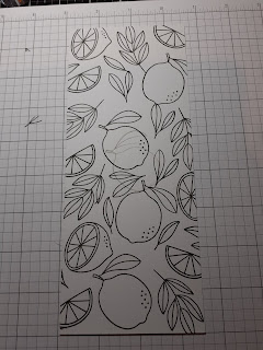
As we discussed these are smaller images so we will use them together, to cover are card base. Which I made using our Neenah Card Stock.
Then before I would just randomly stamp. not really worrying where each image would go, but now I mount all the images i'm going to use. Start at the corner and fit them in as a pattern, which saves great big white gapes. It is much more controlled as it becomes less random.I hope this makes sense.
I am hoping to do a video with the differences soon .
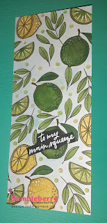
I then coloured my images in the citrus fruit colours, with a mix of alcohol markers and polychromos pencils. I also used a light blue pencil to shade in the white back ground. It helps to make your images pop.
Then stamp and embossed my sentiment on to the black card stock.
Added it to my card and added some beautiful Nuvo jewel drops. Also taking the white pen adding a few dots on the fruit as a high light.
Happy Stamping
and Thank You for Popping on Over.
Jo
xxx


